Get Lifetime Access to 12,400+ Components and UI Builder with ✨ AI Assistant! 👇
🚀 Get it Now!

Tailwind CSS Hero Components

Free

20+ styled Tailwind hero components made with Tailwind CSS and Alpine.js

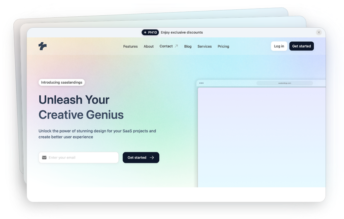
Tailwind CSS Hero Components Image 1
Details About Tailwind CSS Hero Components
Key points:
  • JavaScript Plugin
  • Copy & Paste
  • Tailwind CSS v3.0+
  • Responsive Design

Ever landed on a website and immediately felt captivated by a stunning image or a compelling headline? That's the magic of a hero component at work.

In the world of web design, hero components play a pivotal role in grabbing users' attention and setting the tone for the rest of the site.

What Is a Hero Component?

A hero component, often referred to simply as a "hero," is a prominent element placed at the top of a webpage. It's the first thing visitors see when they land on your site, acting as a visual gateway to your content. This component typically includes a combination of:

  • High-quality images or videos

  • Engaging headlines and subheadings

  • Calls-to-action (CTAs)

  • Background elements like gradients or overlays

The hero component is all about making a strong first impression and encouraging users to explore further.

The Importance of Hero Components

Capturing Attention Quickly

In today's fast-paced digital landscape, you have only a few seconds to capture a visitor's attention. A well-designed hero component can instantly engage users, making them more likely to stay on your site.

Communicating Your Brand Message

Your hero section is a prime spot to convey your brand's identity and values. Through visuals and messaging, you can immediately tell users what your site is about and why they should care.

Guiding User Action

By incorporating clear CTAs, you can direct users toward desired actions, whether it's signing up for a newsletter, checking out a product, or learning more about your services.

Key Elements of an Effective Hero Component

Striking Visuals

The visual aspect is crucial. Use high-resolution images or videos that are relevant to your brand and message. Ensure that these visuals are optimized for web use to prevent slow loading times.

Compelling Headlines

Your headline should be concise and impactful. It needs to communicate the essence of your message in just a few words. Pair it with a subheading if additional context is necessary.

Clear Calls-to-Action

A CTA should stand out and encourage users to take the next step. Use action-oriented language like "Get Started," "Learn More," or "Shop Now."

Responsive Design

With users accessing websites from various devices, your hero component must look great on all screen sizes. This means images scale appropriately, and text remains legible on both desktop and mobile devices.

Best Practices for Designing Hero Components

Focus on Simplicity

Less is often more. Avoid cluttering your hero component with too much text or too many images. A clean, uncluttered design helps users focus on your main message.

Use High-Contrast Text

Ensure your text stands out against the background. If your image is busy or has varying colors, consider adding a color overlay or gradient to enhance text readability.

Optimize for Speed

Large images and videos can slow down your site, leading to a poor user experience. Compress media files and use appropriate formats to keep loading times fast.

Test Different Versions

Experiment with different images, headlines, and CTAs to see what resonates best with your audience. A/B testing can provide valuable insights into user preferences.

Accessibility Matters

Make sure your hero component is accessible to all users. Use alt text for images, ensure sufficient color contrast, and choose legible fonts.

Engagement with Interactive Hero Components

Interactive elements can make your hero component more engaging and memorable.

Background Videos

A subtle background video can add dynamism to your site. Ensure the video is relevant and doesn't distract from your main message. Consider including controls to pause or mute the video for user convenience.

Animation and Motion Graphics

Animations, like parallax scrolling or subtle motion effects, can draw attention to specific parts of your hero component.

Interactive Sliders

For e-commerce or portfolio sites, sliders allow users to see multiple products or projects directly from the hero section.

Storytelling

Storytelling in your hero component can create an emotional connection with your audience.

Tell a Visual Story

Use imagery that conveys a narrative or evokes emotion. This can be particularly effective for non-profits or brands with a strong mission.

Craft a Narrative Headline

Your headline can tell a mini-story or present a problem and solution, engaging users right off the bat.

Use User Testimonials

Featuring a short quote or testimonial can build trust and show real-world impact.

SEO Considerations

While hero components are visually driven, they also impact your site's SEO.

Proper HTML Structure

Use appropriate heading tags (<h1>, <h2>, etc.) for your text. This helps search engines understand your content.

Image Optimization

Include descriptive file names and alt text for images. This not only aids SEO but also improves accessibility.

Load Times

As mentioned, optimizing media files to improve load times can positively affect your search rankings.

Common Mistakes to Avoid

Overloading with Information

Bombarding users with too much information can be overwhelming. Stick to one main message or CTA.

Ignoring Mobile Users

A hero component that isn't optimized for mobile can lead to high bounce rates. Always test your design on various devices.

Autoplay Videos with Sound

Automatically playing videos with sound can startle users and is generally considered poor etiquette. If you use video, keep it muted by default.

Web design trends evolve, and so should your hero components.

Minimalism

A trend toward minimalistic design emphasizes simplicity and clean aesthetics.

Bold Typography

Using oversized, bold fonts can make a strong statement and grab attention.

Micro-Interactions

Small animations or feedback responses enhance user experience without overwhelming them.

The hero component is more than just a pretty picture at the top of your website—it's a powerful tool for engagement, branding, and guiding user action.

By focusing on clear messaging, striking visuals, and thoughtful design, you can create hero components that not only look great but also drive results.

FAQ

Is it necessary to have a hero component on every page?

Not necessarily. While they are effective on homepages, use them where they enhance user experience and support the page's goals.

How do I choose the right image for my hero component?

Select an image that is high-quality, relevant to your content, and resonates with your target audience. It should support your main message and evoke the desired emotion. Avoid stock photos that feel generic; original images can make a stronger impact

How do I create an attention-grabbing hero section with Tailwind CSS?

Our Tailwind hero components come with pre-built attention-grabbing features including high-quality image optimization, responsive typography scaling, and gradient overlays. Simply choose a component and customize the visual hierarchy using Tailwind's utility classes like text-4xl, font-bold, and bg-gradient-to-r.

How do I implement interactive animations in my hero section?

Our Tailwind hero components include ready-to-use animation utilities for micro-interactions and scroll effects. You can easily add hover states, fade-ins, and parallax scrolling using the predefined classes like hover:scale-105, transition-all, and custom animation utilities.

Can I use multiple CTAs in my hero component?

While it's possible to include multiple CTAs, it's generally best to focus on one primary action you want users to take. Having too many options can confuse visitors. If you need additional CTAs, design them to be less prominent than the main one.

Featured Tailwind Components

Discover the most popular Tailwind CSS ui components and elements. Browse top-notch Tailwind components to enhance your development process.